Check out these stunning sculptures of mega talented artist Lisa Gralnick. I’m particularly jazzed by her series, The Gold Standard, which features visually striking and conceptually loaded objects cast in 18k gold and plaster. The amount of gold on each sculpture represents the market value of the object. For example, in the sculpture of the face above, the amount of gold covering the nose correlates to the cost of a nose job. Fascinating stuff. More commentary to come when I see her work this spring in person.
9/29/10
9/27/10
Maureen Connor stickin' it to the glossies
I just learned about artist Maureen Connor and her sculpture Thinner Than You. It's a simple work, but I think a powerful and effective statement on the pressure women feel to be a size zero. Just another example of how contemporary art doesn't have to be obtuse to be good.
9/15/10
Miracle Whip and Harold Edgerton?!
 |
Harold Edgerton photograph |
Andy Warhol would be so proud. Art and advertising collide once again in this Miracle Whip homage to Harold Edgerton. Eagle eye CineRobot caught the reference right away, but I don't see anybody talking about it on the interweb. Think the reference is intentional?
9/8/10
Cris Brodahl and Peggy Preheim
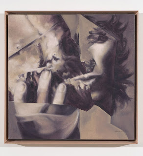
I discovered an intriguing new artist at the Seattle Art Museum- Cris Brodahl (above). I like the mix of both creepy and beautiful tendencies at play in the paintings of this Belgian artist, which are based off collages she creates from magazine images. A gloomy, monochromatic palette and bizarre imagery give her work an eerie quality that evokes the Surrealists of the 1920s with a contemporary edge that reminds me a bit of Peggy Preheim (below). See what you think.
9/7/10
Cy Twombly
Last week the Huffington Post asked Habitually Chic blogger Heather Clawson to curate a collection of interiors around Cy Twombly’s art. In the post, Clawson states that one should never choose art for a room merely because it “goes” with the fabric and furniture. In spite of that disclaimer, there were a few snide comments from readers who thought Twombly’s work was diminished to merely complimenting a great interior instead of standing on its own. It’s pretty obvious that Clawson reveres Twombly’s work by highlighting the interesting dialogue that can take place between his work and some great interiors (see images below). Having a little experience myself in choosing art for a client, the simple fact is that some artists’ work really does seem to fit certain interiors better than others. Twombly’s paintings, with their brilliant color, graphic aesthetic and abstract nature, are a natural choice for many modern spaces. The work doesn’t cower in a room, but instead plays off the dynamism, energy and geometry of the objects in the space.
To see the Huffington Post collection, click here.
Subscribe to:
Comments (Atom)


